Labelling for success
It’s 2049 and you’ve popped down to your virtual wine merchant to buy a bottle of wine to go with your evening meal. As you zoom in on a bottle and ‘walk past’, it shows a 3D image of the vineyard from where the wine comes. There is no label on this bottle nor on any of the others on offer; all are fitted with a microchip and micro-projector, allowing for a scene or design to be viewed in 3D.
If the ‘virtual’ wine merchant is in my imagination (I’m sure there will be more life-like in-store images on the net one of these days, maybe there already are), the rest was suggested by Wicus Maritz, MD of Rotolabel at the Wine Label Design Awards ceremony. As Rotolabel is the sponsor of these awards, Maritz is rather hoping it doesn’t come to pass, at least while he’s still around!
In the meantime, labels of all shapes, sizes and colours remain to tempt or deter as we scour the actual shelves in our local wine merchant or supermarket. It’s a bewildering array but at least on home ground we are familiar with many of the names, so can make decisions drawing on those, rather than relying on the label alone within our chosen price bracket. It’s a different matter in a foreign country, where perhaps none of the names are familiar (if they’re in a language you can understand in the first place!). Here, the label and the rest of the packaging have to sell the wine to you. One might hope the label design communicates the wine style; ie a modern, funky label indicating a modern, funky wine, the more traditional design suggesting the wine is in the classic, traditional mould. It’s not a bad starting point but doesn’t always hold true. So you turn to the back label which, in many of the traditional winelands, isn’t there. Personally, I don’t find the flowery prose on many back labels at all helpful, preferring factual information. But, having Googled back labels, this link provides some food for thought about what does attract consumers to purchase a wine from its back label: www.academicwino.com/2011/07/whats-in-label-importance-of-back-label.html/
The Wine Label Design Awards, first held in 2015, aim to seek out those labels which show originality of concept, execution, shelf appeal and effectiveness as a piece of communication; copy on the back labels would be covered in the last of these criteria.
Convened by Winemag.co.za, this year’s event attracted 50 entries, a drop of 42 on the initial competition but explained by Winemag’s editor, Christian Eedes, who was one of the judges, as due to it not yet being well-established and ‘year one taking care of a number of obvious candidates for entry’.
Entries are divided according to price – R80 a bottle or under, over R80, R500 or over, R1000 and over – as consumers within each range will have different expectations. From a practical point of view, there are no price constraints for wines in a series.
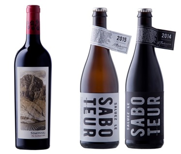
In summarising the judges’ thoughts, Eedes noted that “the overall standard was satisfactory rather than inspired”. Unlike the initial awards, no top prize was awarded this year but there were two golds: Simonsig The Garland 2009 and Luddite’s Saboteur series, both pictured below.
Eedes explained: “Much wine packaging tends to be classical, retaining traditional cues such as the family crest or homestead, or some depiction of terroir. Everything centre, name of brand in elegant but predictable font above or below discreet illustration. These could come from anywhere in the world.”
As Luddite’s Saboteur pair shows, more experimental work is starting to emerge, challenging consumers but also hopefully attracting a new, younger consumer. The pair was liked for the crown cap closure, the tag rather than usual neck label and bold typography. “These showed real confidence on part of both wine producer and design firm,” Eedes noted.
If The Garland is at the top end of the market, the judges were disappointed by the packaging at the bottom end, commenting: “It’s as if consumers who are on a tight budget don’t deserve any extra effort.”
To my mind, a notable exception is The Wolftrap range; the wines come in classy looking bottles with a label that clearly fuses the range. The back label succinctly summarises the wine’s character and why it was so named. They’d sit well on any dining table.
Eedes concluded with the following observation: “It is often impossible to separate the product from the country of origin when branding is at its most successful. Scotch from Scotland, Tequila from Mexico or Bourbon from America.” He believes the challenge now is for designers and producers to portray unequivocally the true face of South African wine.
Over time and as these awards grow, it is hoped that such a goal will be achieved.
The Wine Label Design Awards judges were Rebecca Constable of Woolworths, designers Sean Harrison of Whitespace Creative and Joanne Thomas of The Jupiter Drawing Room, chef Liam Tomlin of Chefs Warehouse & Canteen and Christian Eedes, editor of Winemag.
– Angela Lloyd